

1. What is SCSS?
Definition: SCSS (Sassy CSS) is a preprocessor scripting language that is interpreted or compiled into CSS (Cascading Style Sheets). It extends CSS with features like variables, nested rules, and mixins, making it easier to write and maintain styles for web applications.
2. Role of SCSS in SPFx
Styling Components: In SPFx, SCSS is used to style web parts and extensions. It allows developers to write modular and maintainable styles for their SharePoint solutions.
Enhanced Features: SCSS offers advanced features compared to standard CSS, such as variables, nesting, and functions, which streamline the styling process.
3. Benefits of Using SCSS in SPFx
Variables: Define reusable values (e.g., colors, fonts) that can be used throughout the stylesheet.
Nesting: Write cleaner and more readable styles by nesting CSS selectors in a hierarchical manner.
Mixins: Create reusable blocks of code that can be included in multiple places within the stylesheet.
Partials and Imports: Break styles into smaller, manageable files and import them into a main stylesheet.
Inheritance: Use the @extend directive to share a set of CSS properties from one selector to another.
4. Setting Up SCSS in SPFx
When creating a new SPFx project, SCSS is configured by default. Here’s how it integrates into the development workflow:
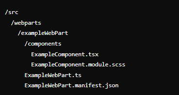
a. Folder Structure
src/webparts/<webpartName>/components/: Contains the main React components and SCSS files.
src/webparts/<webpartName>/components/<ComponentName>.module.scss: SCSS file associated with a specific component.
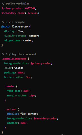
b. Example of SCSS File (ExampleComponent.module.scss)
c. Importing and Using SCSS in a Component
In the corresponding React component file (ExampleComponent.tsx), import and use the SCSS styles:

5. SCSS in SPFx Build Process
Webpack Configuration: SPFx uses Webpack to compile SCSS into CSS and include it in the final bundle. This happens automatically during the build process, so developers don’t need to manually configure Webpack for SCSS.
Minification and Optimization: The build process also minifies and optimizes the generated CSS, ensuring efficient delivery to end-users.
6. Best Practices for Using SCSS in SPFx
Modularization: Break down styles into small, reusable SCSS modules to maintain readability and manageability.
Consistent Naming Conventions: Use consistent naming conventions for class names and variables to enhance clarity and maintainability.
Avoid Global Styles: Scope styles to specific components to avoid conflicts and ensure encapsulation.
Leverage Variables and Mixins: Use variables for colors, fonts, and other constants, and mixins for reusable style patterns.
7. Example Project Structure
Summary
Using SCSS in SPFx enhances the development experience by providing powerful features that streamline the process of writing and maintaining styles. By leveraging SCSS, developers can create modular, maintainable, and scalable styles for their SharePoint solutions.